In my local climbing community, almost everyone talks about wanting to “train smarter,” but very few people actually log their sessions in a way they can stick with. Paper notebooks get lost, and generic fitness apps don't capture the things climbers care about—like session type and how the session actually felt.
Peak started as a way to solve a problem I was personally running into: I wanted a simple way to see, at a glance, how often I was climbing, what types of sessions I was doing, and whether my training was trending in the right direction. I also wanted the logging flow to be fast enough that I would actually use it after a long session.
Talking with climbers and watching content from climbing coaches made it clear that duration and session type were not enough. Coaches cared deeply about qualitative factors like strength, perceived effort, and mood. Peak's design is built around making those ideas loggable without turning every session into a giant form.
What I did
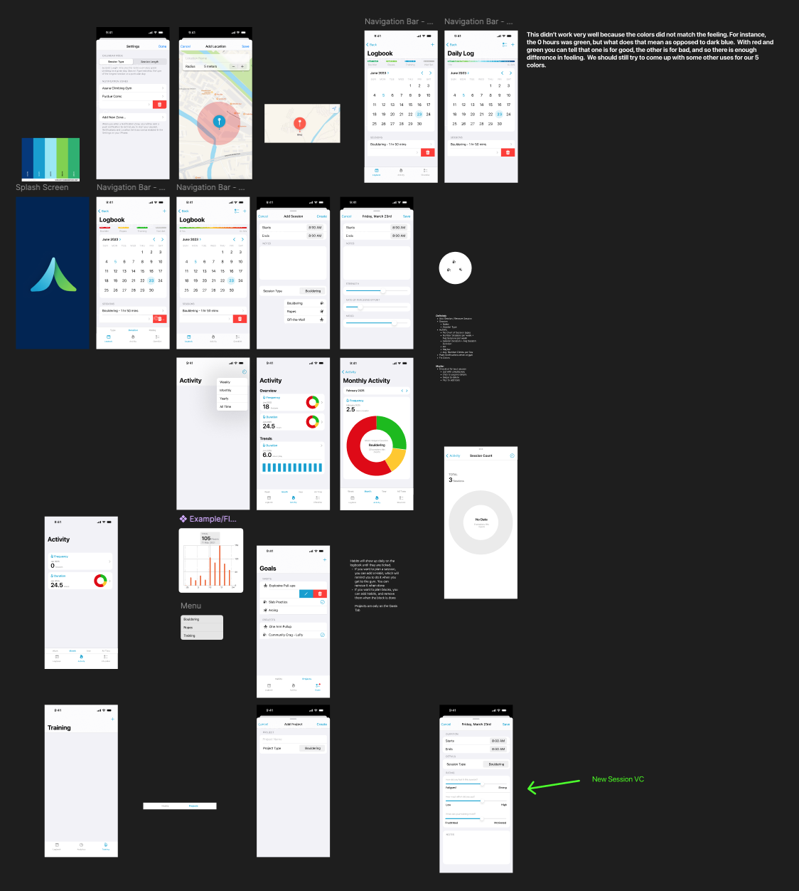
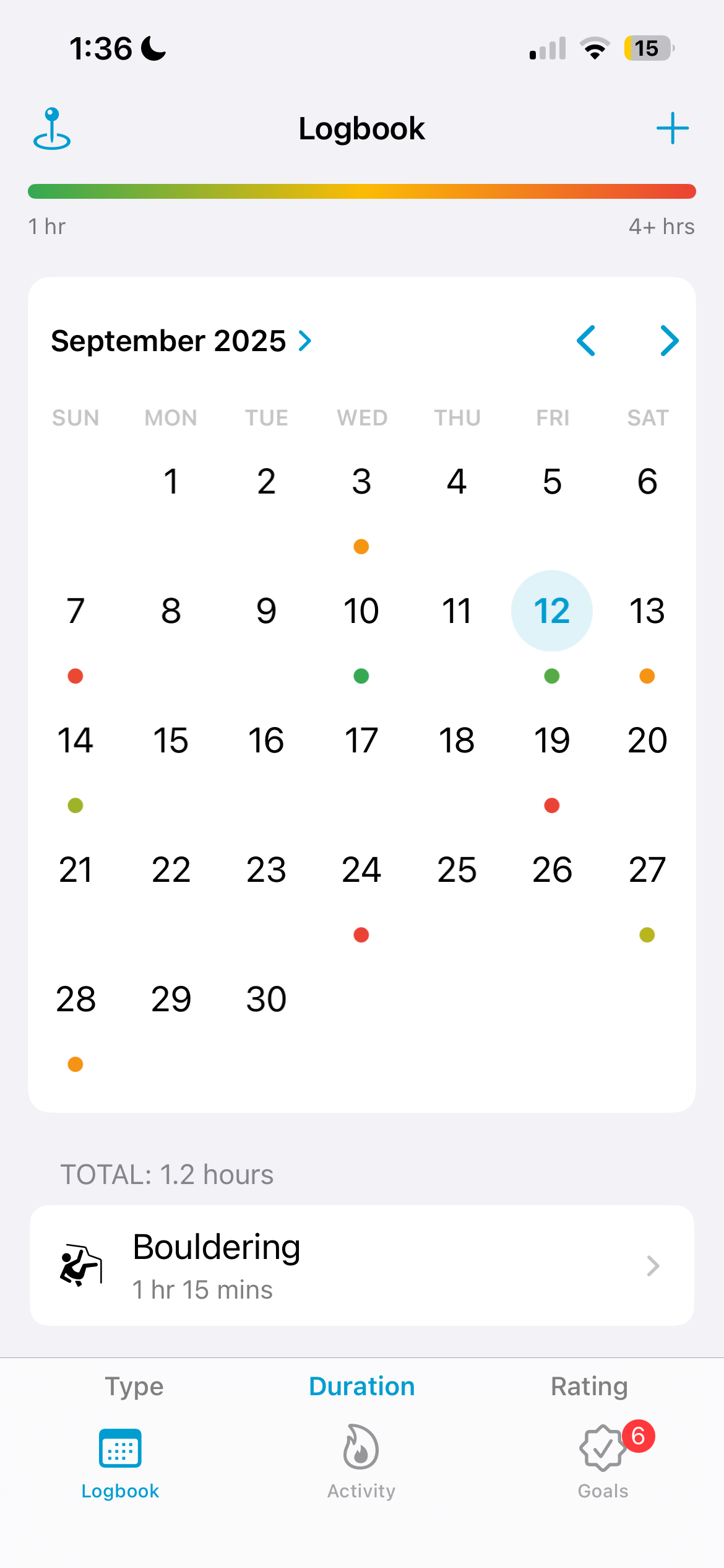
Designed the core concept of Peak as a calendar-first climbing logbook, where each day shows sessions as small colored dots with a legend explaining type, duration, and rating.
Implemented the main logbook screen using UICollectionView with compositional layout so it could gracefully handle multiple sessions per day, the color key, and summary details.
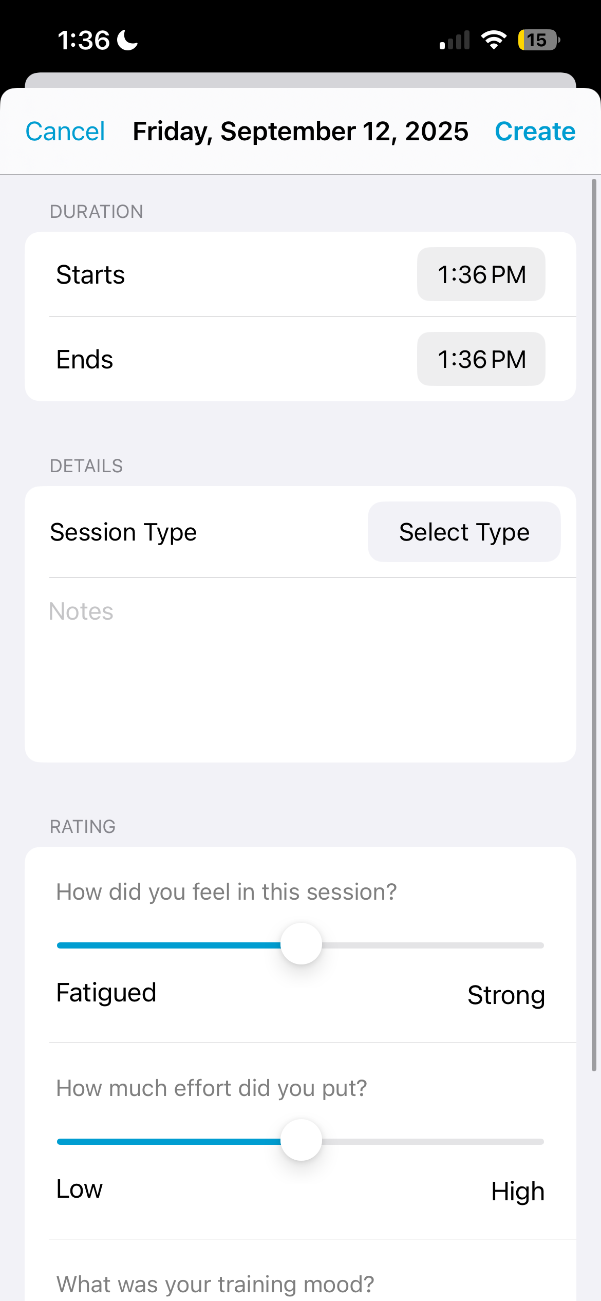
Designed and built the “Add Session” flow, including sliders for strength, RPE (effort), and training mood—metrics chosen after researching how coaches evaluate session quality.
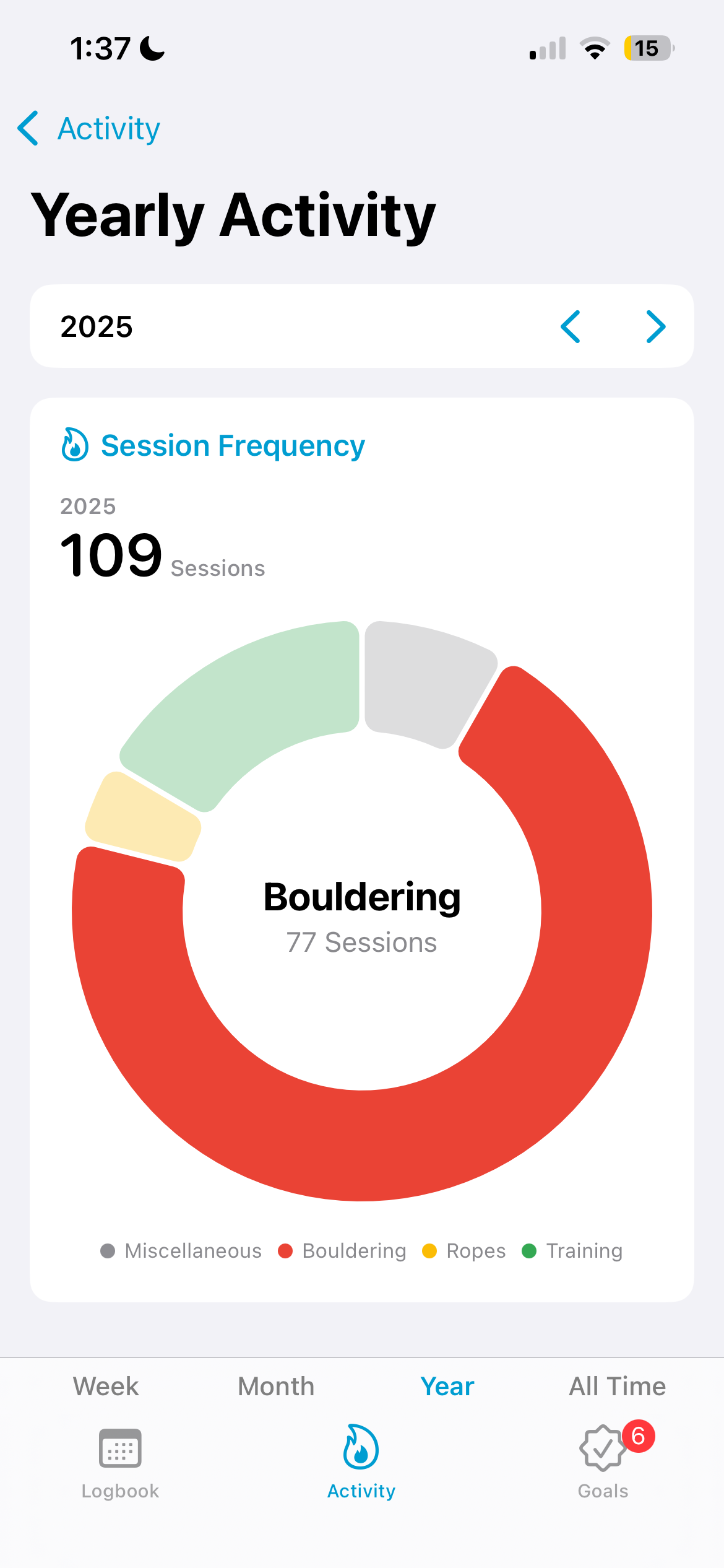
Created an Activity section with pie charts and bar charts for session frequency, session duration, and duration trends across week, month, year, and all-time views.
Learned SwiftUI and Swift Charts, then integrated SwiftUI-based chart views into a UIKit navigation structure so I could keep the rest of the app on UIKit while still using native charting.
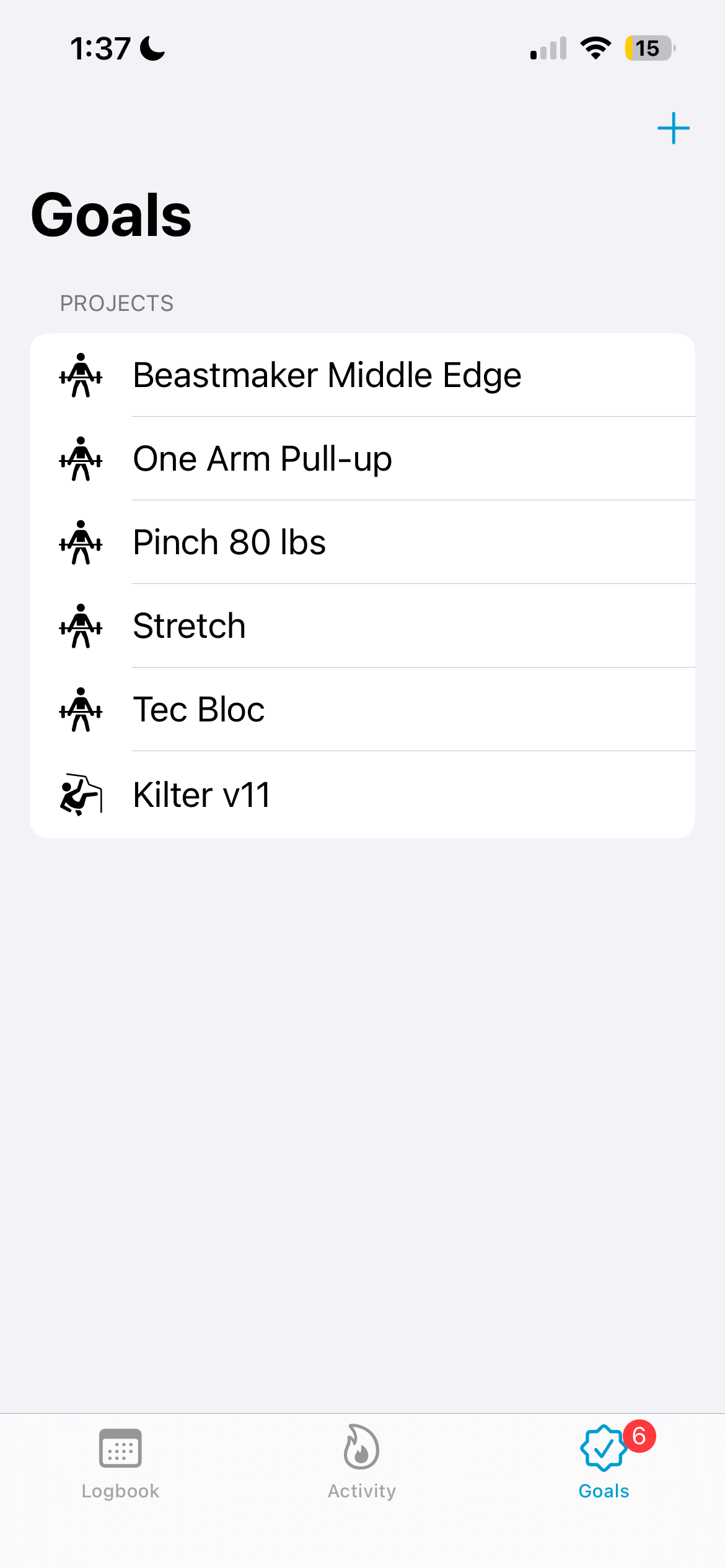
Built a Goals screen where climbers can track training goals (e.g., weighted hangs, one-arm pullups) and project goals (boulders and routes), and get gentle reminders to work on them.
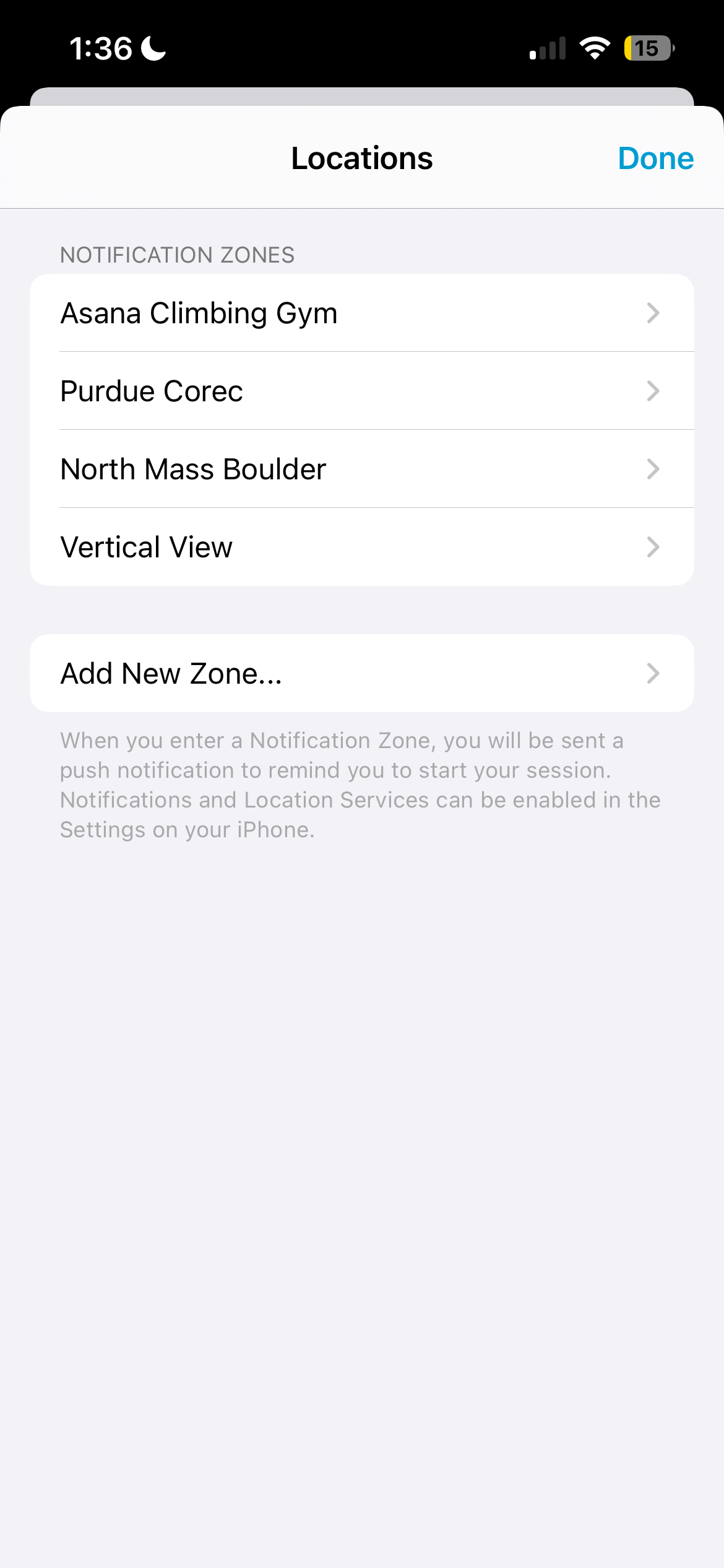
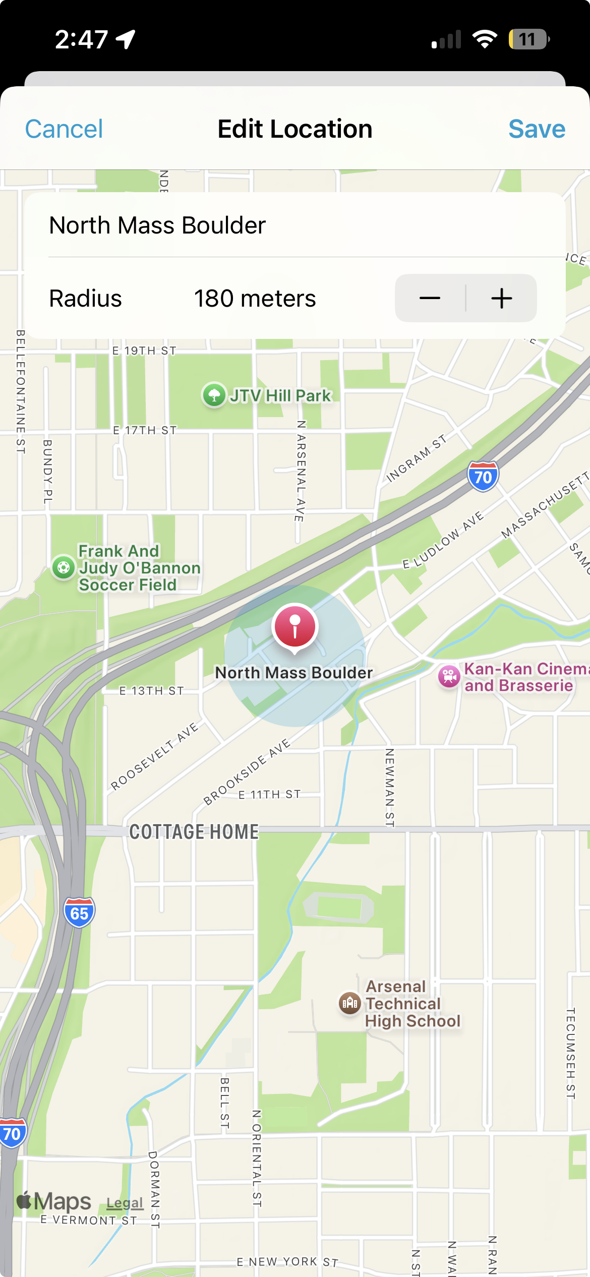
Designed and implemented “Location Zones,” where users can define gyms or crags and receive a reminder to log when they arrive, reducing forgotten sessions without spamming notifications.
Gathered feedback from the Purdue climbing community by testing Peak myself, chatting with climbers at the wall, and iterating on features like ratings and goals in response to real usage.
Process
Research & Insights
My starting point was simply trying to log my own sessions. I quickly learned that if the logging flow took more than a few taps, I would skip it entirely—especially on long training days.
I talked informally with climbers at the Purdue wall and paid attention to how they currently tracked progress. Most used a mix of memory, photos, and occasional notebook entries; very few had a consistent system.
To decide what to measure, I watched videos from climbing coaches and read their training advice. Across different sources, three ideas kept coming up: how strong you felt, how hard the session was, and how your mood held up. That led to Peak’s three sliders: Strength, RPE, and Training Mood.
Designing the Calendar-First Experience
From the beginning, I wanted the calendar to feel like the “home base” of the app. Each month view shows sessions as small colored dots, with a legend and gradient bar explaining how color encodes duration, type, and rating.
The first MVP used table views and a simpler layout, which was enough to validate that the calendar metaphor worked and that climbers liked seeing their month at a glance.
As I added features like multiple sessions per day and richer daily summaries, the table view approach started to feel brittle. I rebuilt it using UICollectionView with compositional layout so the calendar grid, legend, and detail sections could all live in a single, flexible layout.
Figma exploration for Peak, showing early calendar concepts, activity views, and logging flows.
Logbook screen with monthly calendar and dots whose colors encode duration.
Prototyping Logging & Analytics
Once the calendar structure felt right, I focused on the logging experience itself. The Add Session view needed to be fast enough that climbers would actually use it after a session, but still capture meaningful details.
I designed a form-style layout with a few core fields—type, duration, notes, and three sliders for Strength, RPE, and Training Mood. I tested this flow on myself and on climbers at the Purdue wall, paying attention to how long it took them to log a session and whether the language on the sliders felt intuitive.
For the Activity screen, I prototyped different combinations of cards and charts in Figma before committing to implementation. The final design uses a small set of clear metrics (frequency, duration, trends) with a custom stacked tab bar at the bottom for switching between time ranges, so the navigation stays consistent as the stats change.
Activity overview with frequency, duration, and trend cards, each navigable to a more detailed chart.
Technical Approach
Under the hood, Peak is primarily built in UIKit. Most screens are UICollectionView controllers using compositional layout, which turned out to be a big upgrade over my original table view–based MVP for handling complex sections like calendar grids and stacked analytics cards.
For the charts, I decided to use SwiftUI and Swift Charts instead of a third-party UIKit library. That meant learning SwiftUI and figuring out how to host SwiftUI views inside a UIKit navigation stack, but it gave me native, well-documented charting primitives that render cleanly and are easy to extend.
Session data is modeled so that qualitative ratings roll up into a single color-coded representation on the calendar, while still being available for deeper analysis on the Activity screen. This keeps the main UI simple without throwing away detail.
Outcomes & Impact
Peak is actively used by climbers at the Purdue climbing wall, and I still get organic feedback in person about which parts people love and which areas they want to see expanded—especially around goals and more advanced analytics.
It was the first app I released publicly on the App Store, which made the entire process feel real: from designing flows, to shipping an MVP, to handling App Store submission and updates.
Several climbers have told me that the location-based reminders make it easier to remember to log sessions as they walk into the gym, and that they prefer those contextual prompts over random time-based notifications.
On the technical side, Peak is where I really internalized the power of UICollectionView with compositional layout and learned how to integrate SwiftUI views into a UIKit app. Those lessons have directly influenced how I architect later projects for Pebbled and MusicSketch.
Reflection & Next Steps
One thing I did well on Peak was respecting the idea of an MVP. I tried not to add features just because they were interesting, and instead waited to see whether my own use or feedback from other climbers exposed a real need. That discipline kept the app focused on the calendar and logging flows, which are why people use it.
At the same time, my process for gathering feedback was pretty informal, mostly conversations at the wall and occasional comments from friends. I set up TestFlight, but I never built a structured way for people to send bug reports or feature requests, so most feedback only reached me if someone remembered to mention it in person.
If I continue working on Peak, I would like to build a better feedback pipeline: lightweight in-app prompts to send logs or suggestions, more intentional TestFlight groups, and clearer instrumentation around which screens people actually use. That would help me evolve the app based on data and structured input, not just anecdotes.
Overall, Peak confirmed that I enjoy building tools that fit naturally into people's routines, and it gave me the confidence to tackle more ambitious product ideas like Pebbled.