A collection of my favorite features I've designed and implemented for MusicSketch, a collaborative songwriting app.
Role
iOS engineer & product/UI collaborator
Duration
2022–present
Team
Small cross-functional team (founders, engineers, marketing, music consultants)
Tools
Swift, UIKit, SwiftUI, Swift Charts, ReplayKit, Figma, Shortcut
Problem & Context
MusicSketch is a mobile app that helps songwriters capture and refine musical ideas on the go. Over the past year and a half I’ve focused on features that make it easier for non-technical musicians to mix songs, select chords, record performances, and experiment with rhythm.
Because we’re a small team, each feature needs to balance musical expressiveness, technical feasibility, and the reality that many singer/songwritters don’t read traditional notation. My work has been a mix of designing UIs, implementing them in iOS, and collaborating closely with marketing and music consultants.
What I did
Designed and implemented a modular audio mixer used in every song to manage tracks, levels, and options.
Redesigned the chord keyboard into a more robust, modular component that prevents invalid chord combinations.
Built a video recorder flow that lets users (and the marketing team) capture screen + audio + video using ReplayKit.
Led the interaction design and iOS architecture for an upcoming notation feature that speeds up rhythm entry (details kept high-level due to NDA).
Introduced clearer Shortcut story templates and acceptance criteria to keep complex features scoped and shippable.
Process
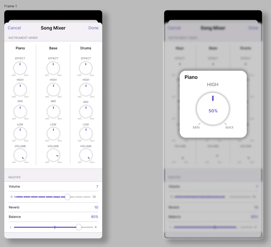
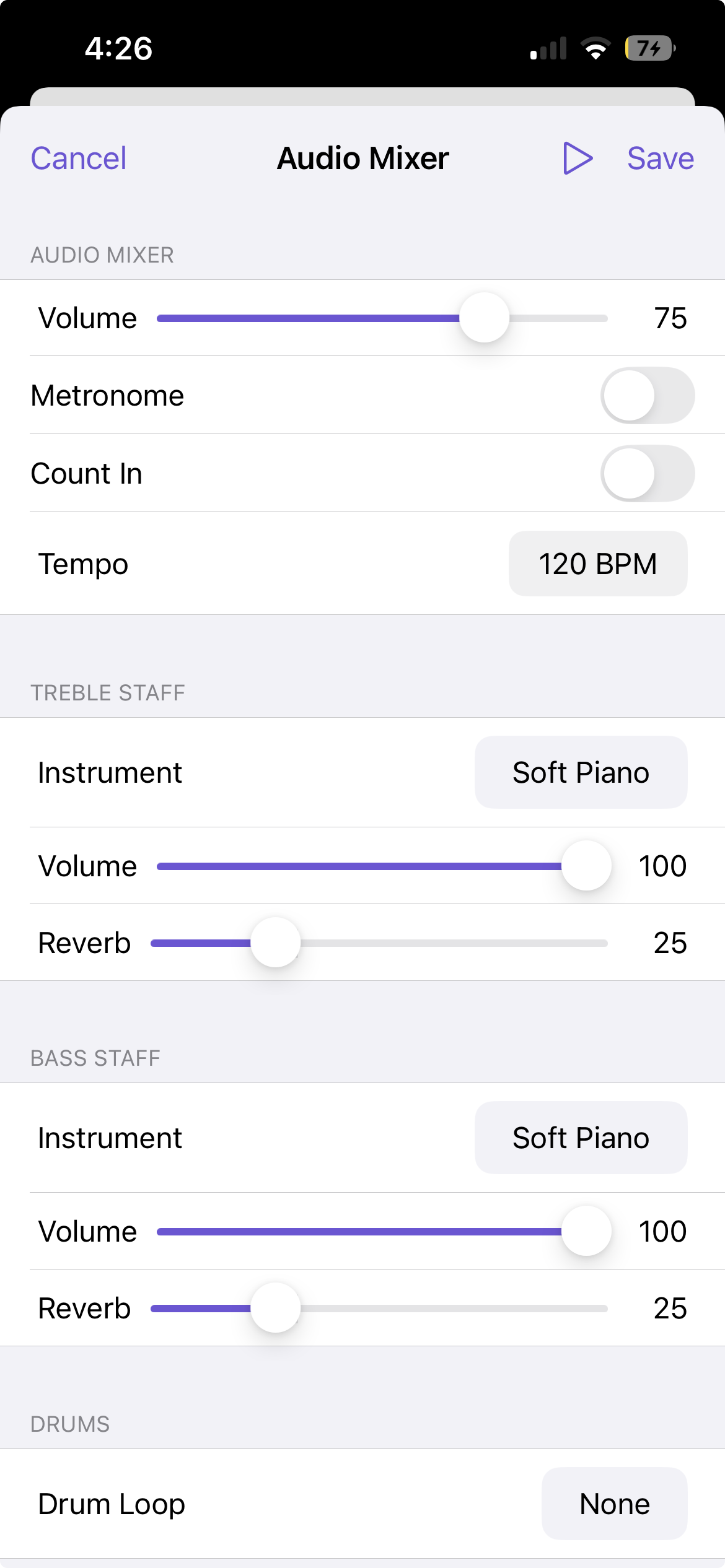
Audio Mixer
The audio mixer manages all of the tracks in a song: master, treble, chords, bass, drums. It’s where every arrangement in MusicSketch ultimately gets balanced.
I started by researching hardware mixers and DAWs to understand common patterns like channel strips and master sections, then mapped those ideas to what our users actually needed: simple control over a few key parameters rather than a full studio console.
My first Figma mocks leaned into “realistic” mixer visuals with lots of knobs. In reviews it became clear this was too busy and didn’t match the rest of the app, so I iterated toward a flatter, card-based layout that read cleanly on phones and tablets.
Implementation-wise, I built the mixer as a UICollectionView with compositional layout. Separate sections handle track tiles, global controls, and optional advanced settings, which makes it easy to add new options over time without rewriting the layout.
Early mixer exploration based on hardware mixers—visually rich but ultimately too busy for our users.
Final modular mixer design: a simpler card-based layout implemented with UICollectionView compositional layout.
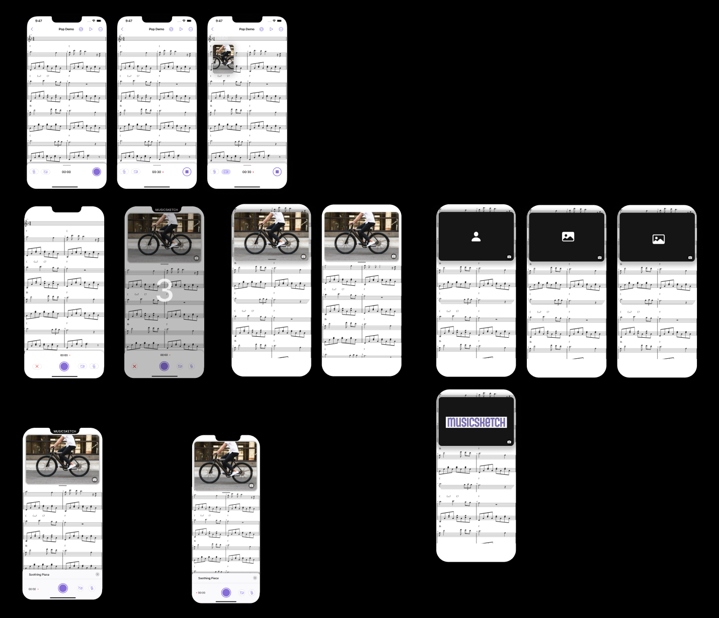
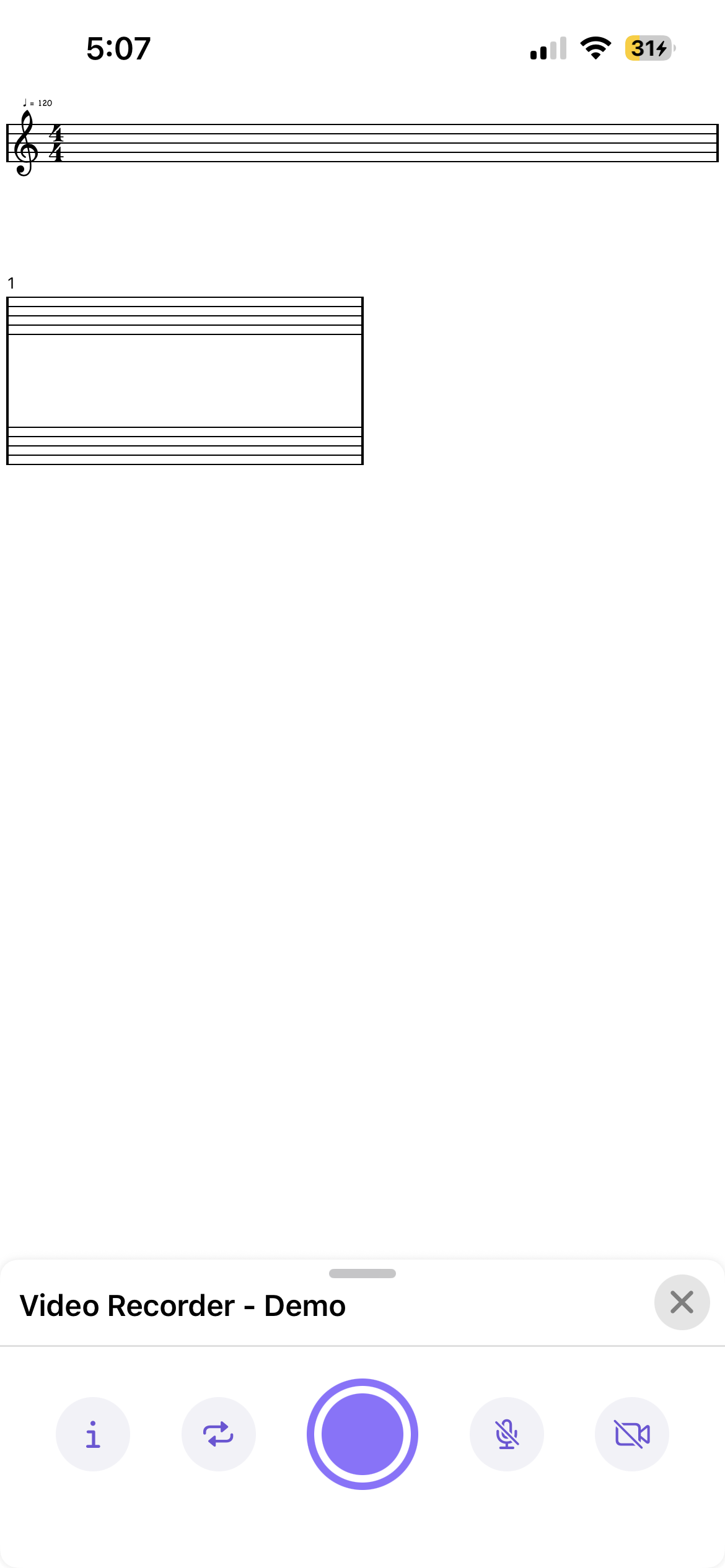
Video Recorder
The video recorder lets users capture their screen while a song plays back, with optional camera and mic recording so they can sing or play along. Marketing also uses it to create promo and tutorial videos directly from the app.
I met with the marketing team to understand what a “good” recording flow looked like for social content.
In Figma I explored flows ranging from very pro (lots of toggles) to ultra-minimal. We landed on a middle ground: one prominent record button and a small set of clear options, so first-time users aren’t overwhelmed.
On the implementation side, I wired up Apple’s ReplayKit for screen and system audio capture, plus optional mic and camera input wrapped in a custom UIKit overlay. A lot of the work was handling edge cases: permissions, storage limits, interruptions, and keeping the UI resilient when hardware isn’t available.
Recorder concepts balancing a single main action with just enough options for marketing and power users.
Promotional remix of Stranger Things main theme created by the marketting team using the Video Recorder.
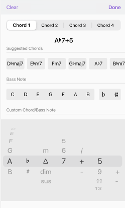
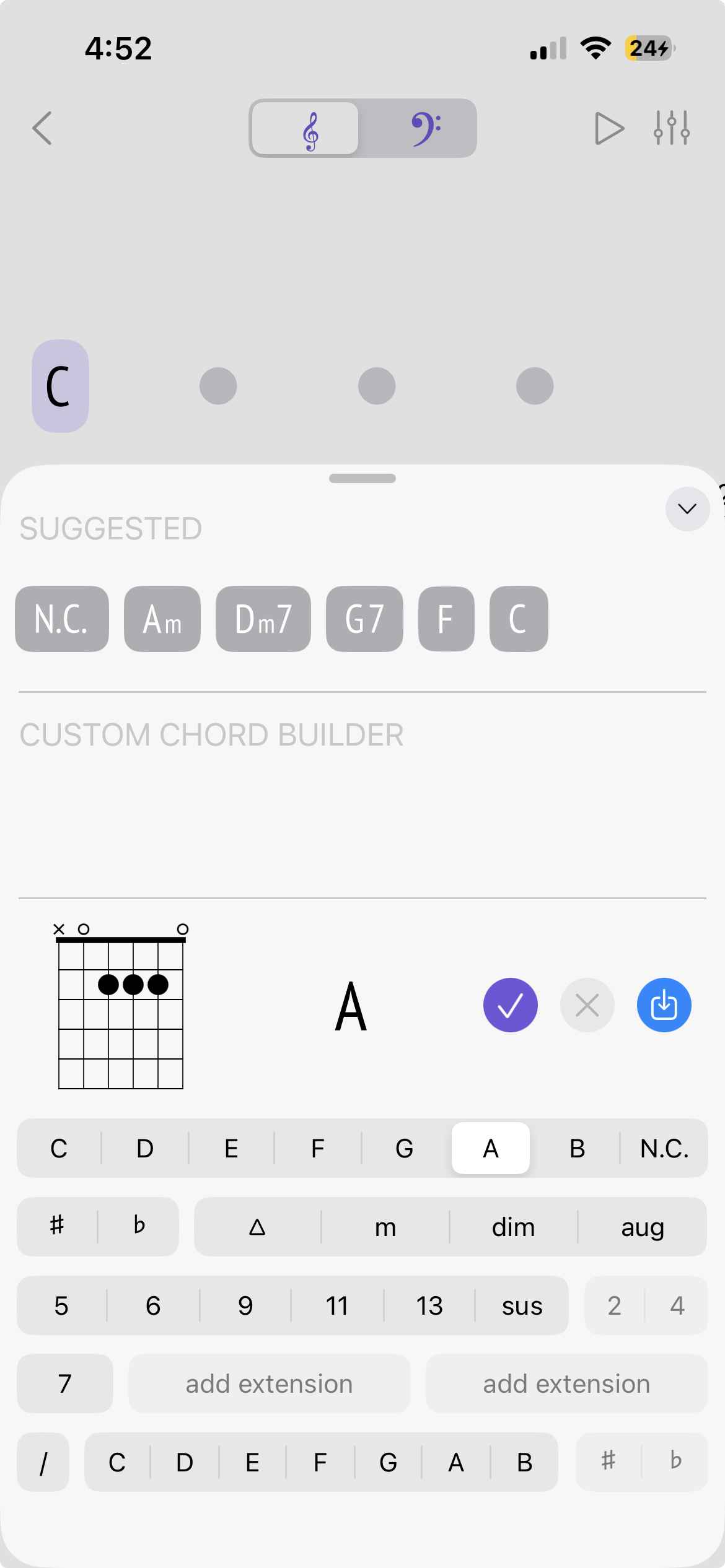
Chord Keyboard – modular chord selection
The chord keyboard is the main control for choosing chords in MusicSketch. The original version used a set of scroll wheels that made it possible to dial in impossible chord combinations, which confused users and caused bugs.
Working with our senior developers, I rebuilt the keyboard into a modular layout where chord qualities and extensions are grouped and visible. Impossible combinations are automatically disabled, so users see what’s valid instead of discovering it via error states.
In the implementation, I kept the chord data model and UI loosely coupled so adding new chord types is mostly a data change rather than a layout rewrite. The component is reused in multiple parts of the app.
Original scroll-wheel chord selector, which allowed many invalid combinations.
Redesigned chord keyboard: grouped options with invalid combinations disabled, making chord choices clearer.
Upcoming Rhythm Tool
For about a year I have been working on a bit upcoming feature that helps users enter and manage rhythmic patterns more quickly, especially players who don’t read traditional notation. It is designed to make building strumming patterns feel more like arranging blocks than editing notation symbols.
I lead the interaction design and iOS implementation at a high level, working closely with marketing and music consultants to understand how guitarists and songwriters actually think about rhythm.
Because the feature touches core musical data and is still unreleased, I keep the details intentionally high-level. The UI is composed of multiple coordinated sections built with UICollectionView compositional layout, and a shared view model keeps them in sync so edits in one place update the overall rhythm consistently.
As the design evolved and feedback from consultants accumulated, I created Shortcut story templates with clear acceptance criteria to break work into smaller, testable pieces. That structure has helped keep scope under control and made it easier for the team to prioritize what should ship first.
Outcomes & Impact
The audio mixer UI I designed and implemented is now used in every song in MusicSketch, and its modular layout has made it straightforward to add new track options over time.
The video recorder is used regularly by the marketing team to produce demo clips and social media content directly from the app, and some users use it to create their own tutorials.
Redesigning the chord keyboard significantly reduced invalid chord configurations and made chord selection more predictable and transparent for users.
On the team side, introducing structured Shortcut story templates and acceptance criteria has made it easier to manage complex features like Strum Builder and prioritize what actually needs to ship.
Reflection & Next Steps
Working on MusicSketch has reinforced how much I enjoy the intersection of product thinking and implementation. Many of these features started as rough ideas from marketing or consultants and had to be translated into flows that feel approachable for non-technical musicians.
Across these projects I’ve seen the value of starting with a focused MVP, then layering in complexity only when real use and feedback demand it—whether that meant simplifying a hardware-inspired mixer, tightening the chord keyboard, or scoping Strum Builder into smaller shippable pieces.